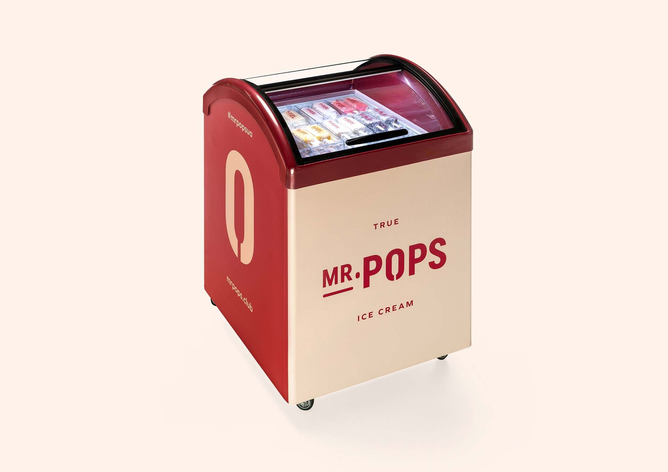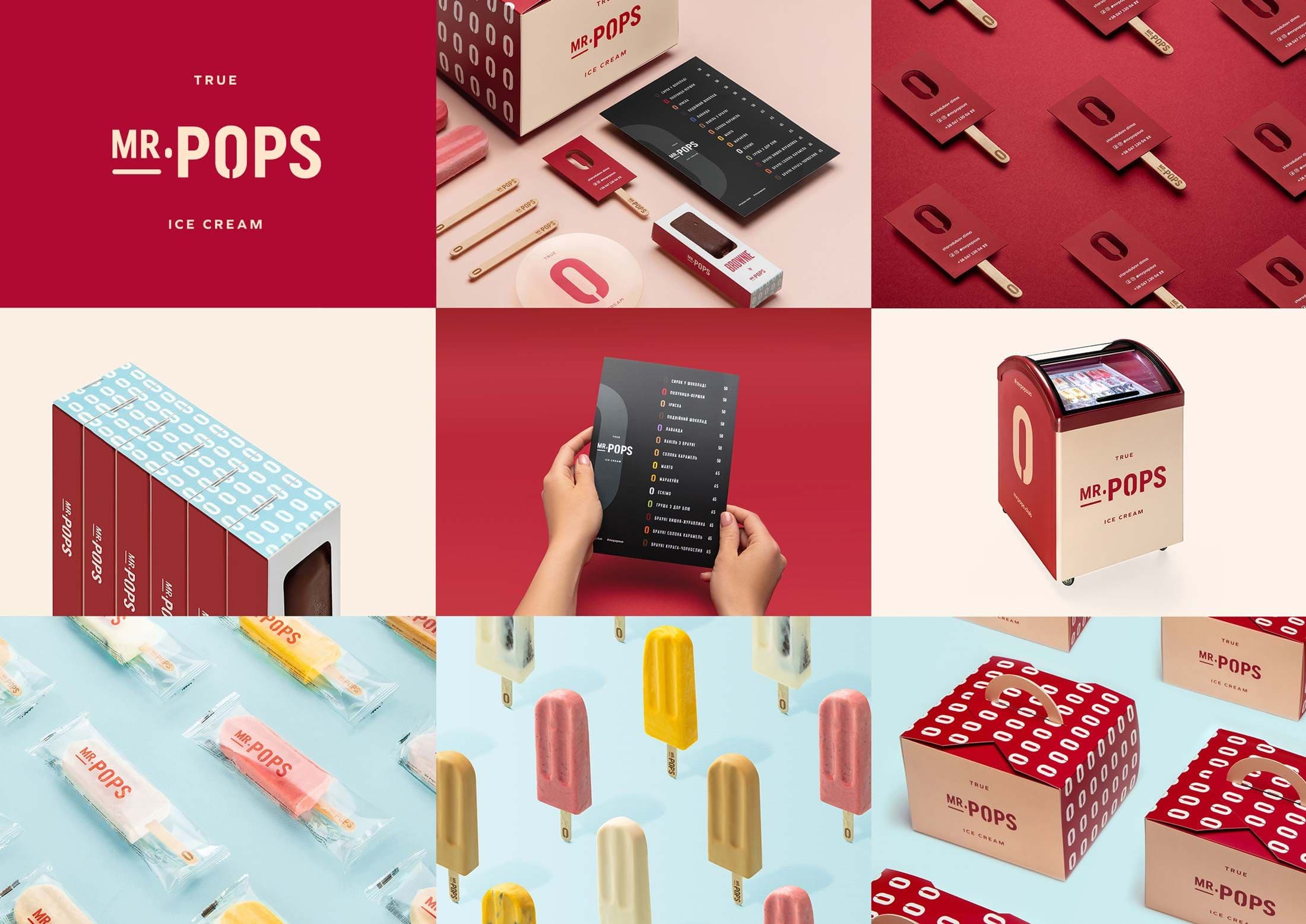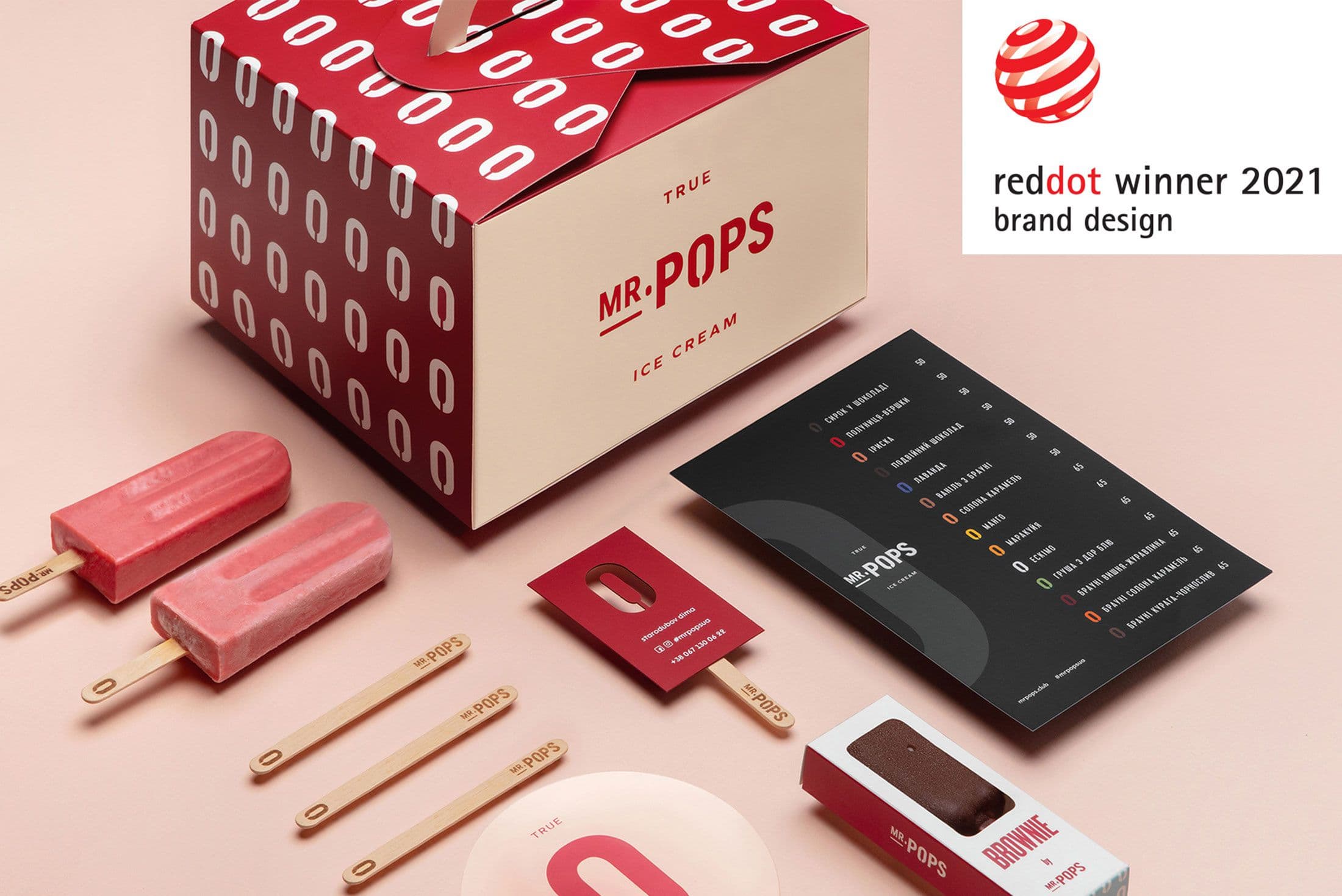
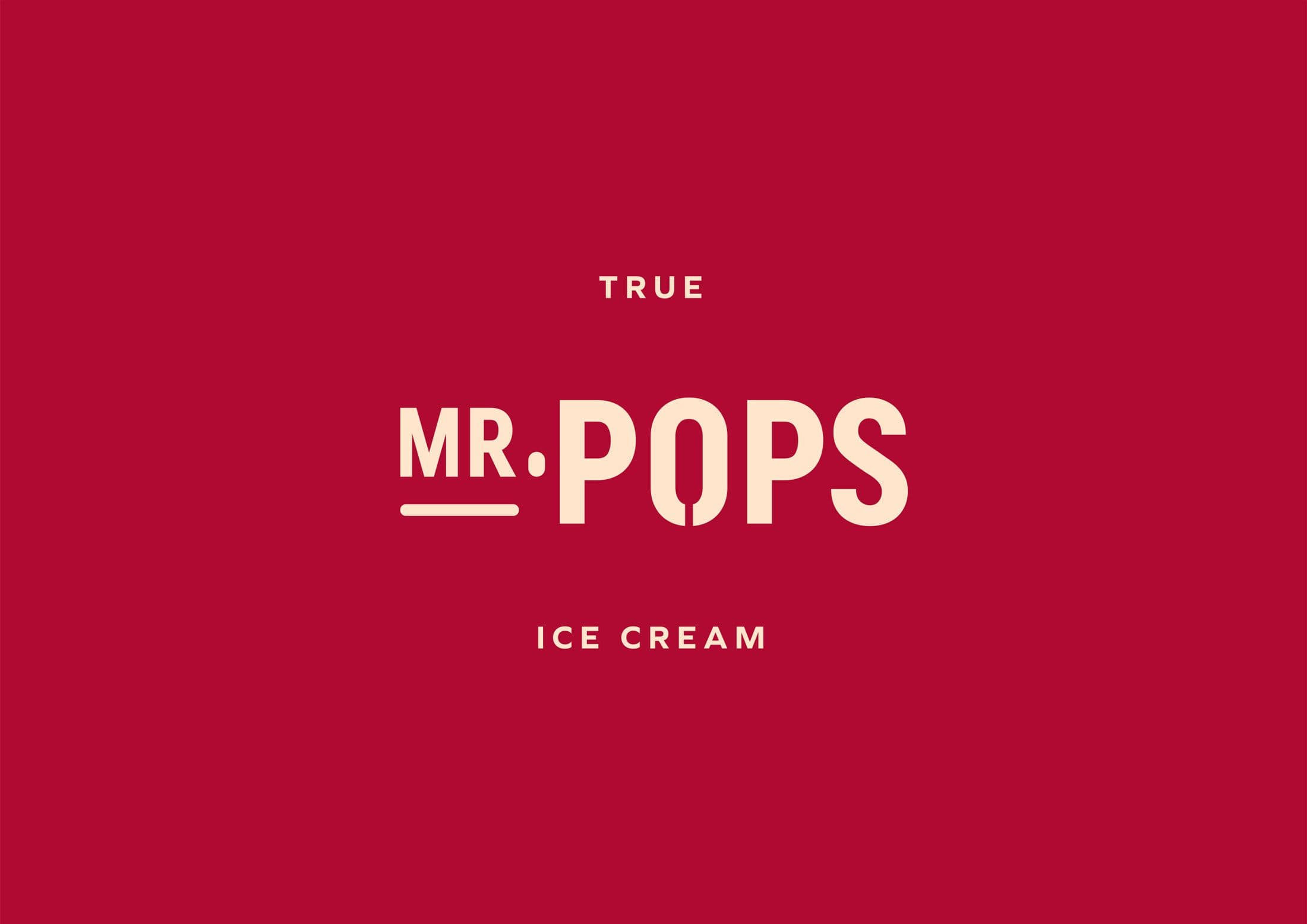
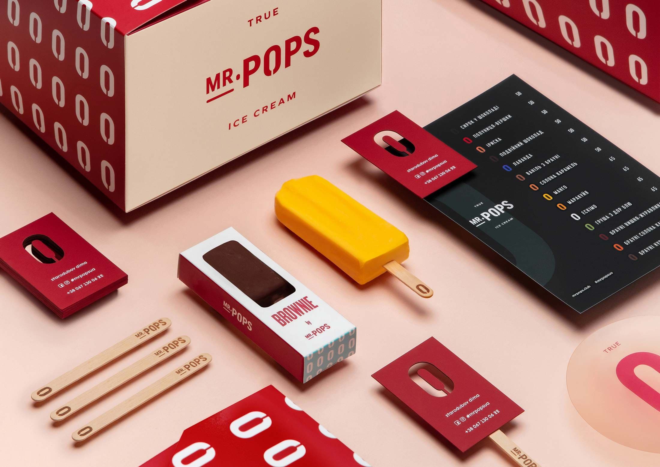
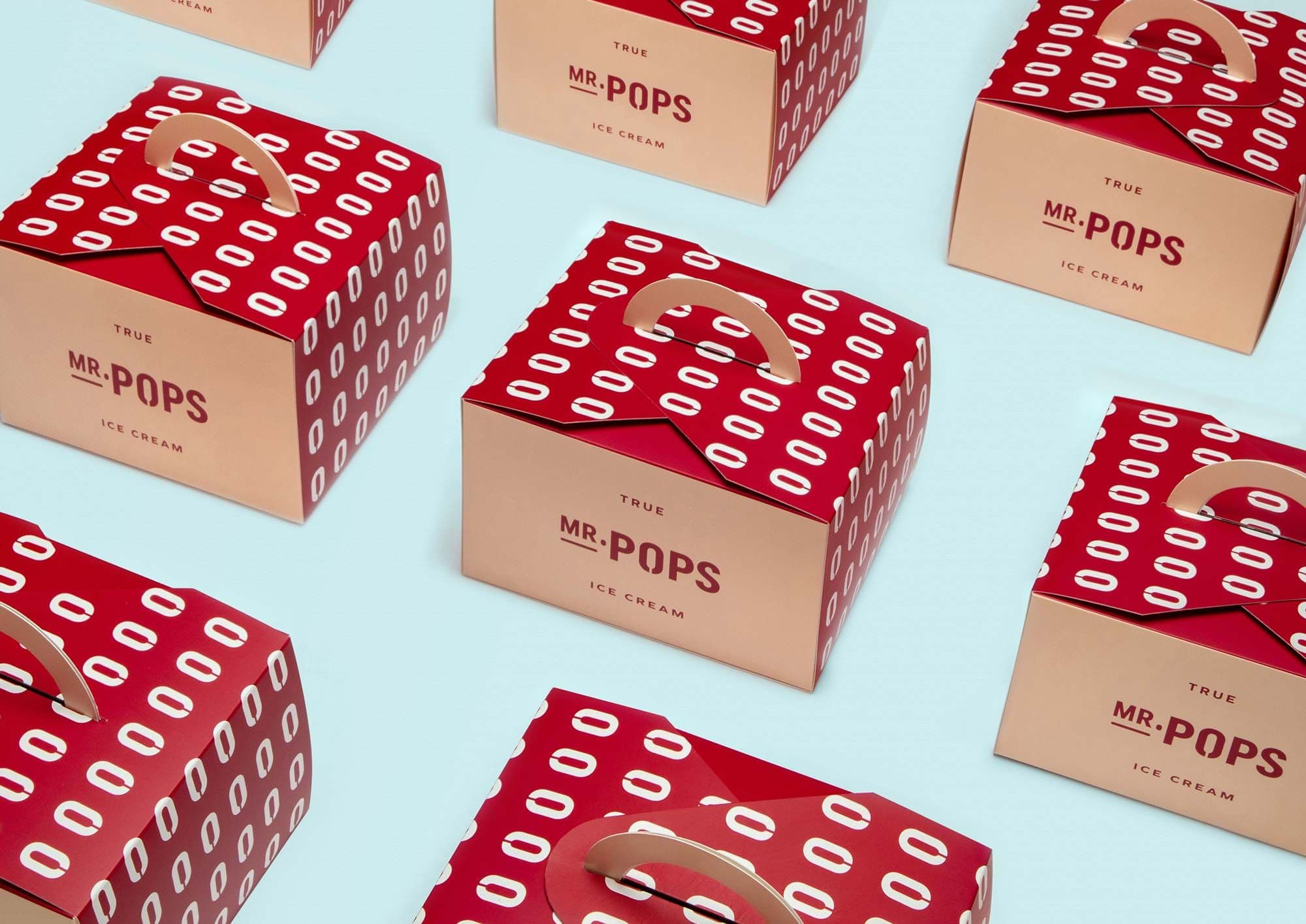
Mr.Pops is a well-known brand of ice cream lollies in Ukraine. The task was to develop a new brand design as well as several types of packaging. The idea for the design of the word mark is based on a graphic element integrated into the letter “O”, which makes the letter resemble the contour of an ice lolly. This surprising effect was so unique that the modified letter now serves as a key graphic element and was adapted for all assets. In combination with high-contrast colour areas, this creates an overall distinctive appearance.
“MR.POPS WAS AWARDED BY 🔴 REDDOT DESIGN IN BRAND DESIGN COMMUNICATION CATEGORY”